Day 2: Tools
Tools
You will switch off teaching with Jed a couple times for this class. The orange parts are your roles.
Set expectations, we won’t make you experts in design because someone could study design their whole life, but you will have enough of an introduction to make your poster better.
Have students list elements of design, highlight the ones we’ll talk about.
Structure
“Prose is architecture, not interior decoration” A conference poster without a planned structure is as attractive as a body without a skeleton. Show pictures of painting compositions with lines superimposed. Show clip of designers for national parks
Open PowerPoint, set size to 36″ x 48″ (Portrait)
Demo grids
Type
Serif vs San Serif
Sizing – enlarge to print size and step 5 ft away. May be a good idea to print a section of your poster full size on 8.5 x 11 sheet to make sure text looks good.
Choose fonts that go well with each other, this may mean choosing variations of the same family, or do web search for font pairings
Need bold or italics – don’t press B or I because every time you do that a typographer dies, use a font made for those features
Add emphasis so that viewer knows what’s most important
Color
Artists plan colors before painting.
Pallets: Talk about the value of a color pallet.
Saves time (a lot of it if you have to do color redos)
Pallets often contains analogous colors and an accent color along with bridge colors for the two.
Pick your images first then have shapes, lines and features match.
Demo stock photo sites, and talk about usage rights definitions
Royalty-free Stock Photo sites: https://unsplash.com/ or pixabay.com
Demo removing background
Demo Adobe Color
Posterize (Image Trace) a photo
Demo eyedropper (on Mac, you can eyedrop anything on the screen. On PC, only within PowerPoint document)
Use the color from the eyedropper tool to Demo Adobe Color
Apply background color
Reduce opacity
Practice Files: tiny.cc/CPD2018 (must be uppercase)
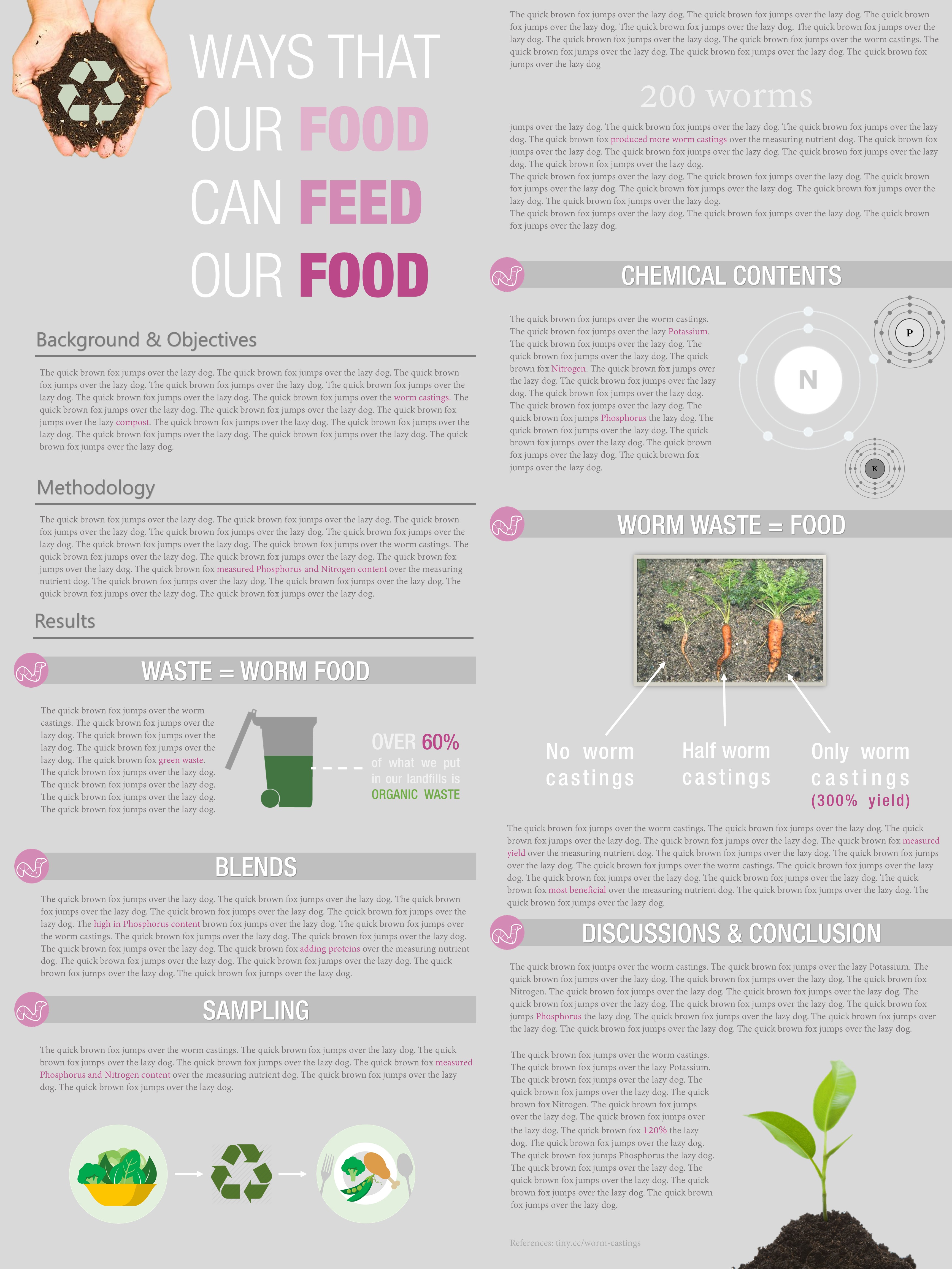
Note that you won’t have time to get yours to this point^ during this class. Also, it’s not a perfect example–it has way too much text and looks a little busy.

